Kick & Gilman LLC
Case Study
To understand how the firm was presenting itself, I conducted a comprehensive brand audit across their advertisements, printed materials, and digital presence. The audit revealed a lack of visual consistency and no established brand system. Without a defined logo, their name appeared in different fonts, layouts, and styles depending on the piece being produced, resulting in a fragmented and unstructured identity.
While the firm had built strong credibility within their community, their visual presence did not reflect the professionalism or stability of their practice. The goal was to create a cohesive brand foundation, including a formal logo, visual system, and website, to unify their presence and establish a clear, credible identity.
The Challenge
Kick & Gilman did not have an official logo or defined brand guidelines. Their name was simply typed out each time new materials were created, resulting in inconsistencies across:
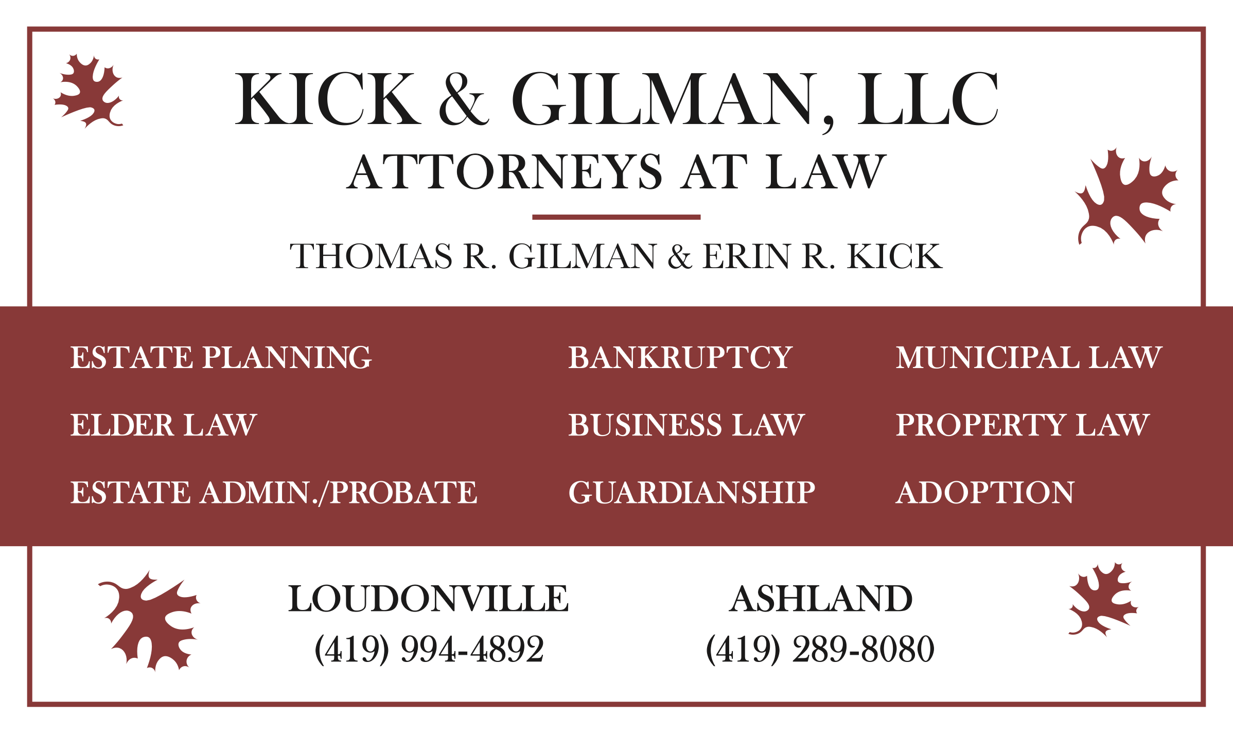
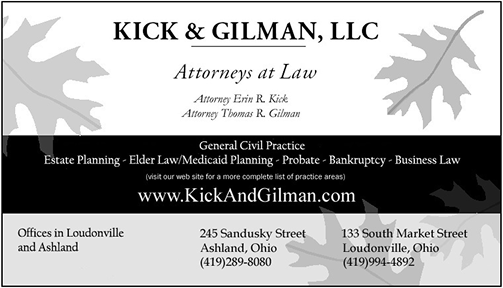
Advertisements
Printed collateral
Website and digital presence
Internal and external communications
This lack of consistency weakened brand recognition and made the firm appear less established than they were. Without a unified visual identity, every new piece required starting from scratch, slowing production and wasting unnecessary time and increasing the risk of further inconsistency.


The Approach
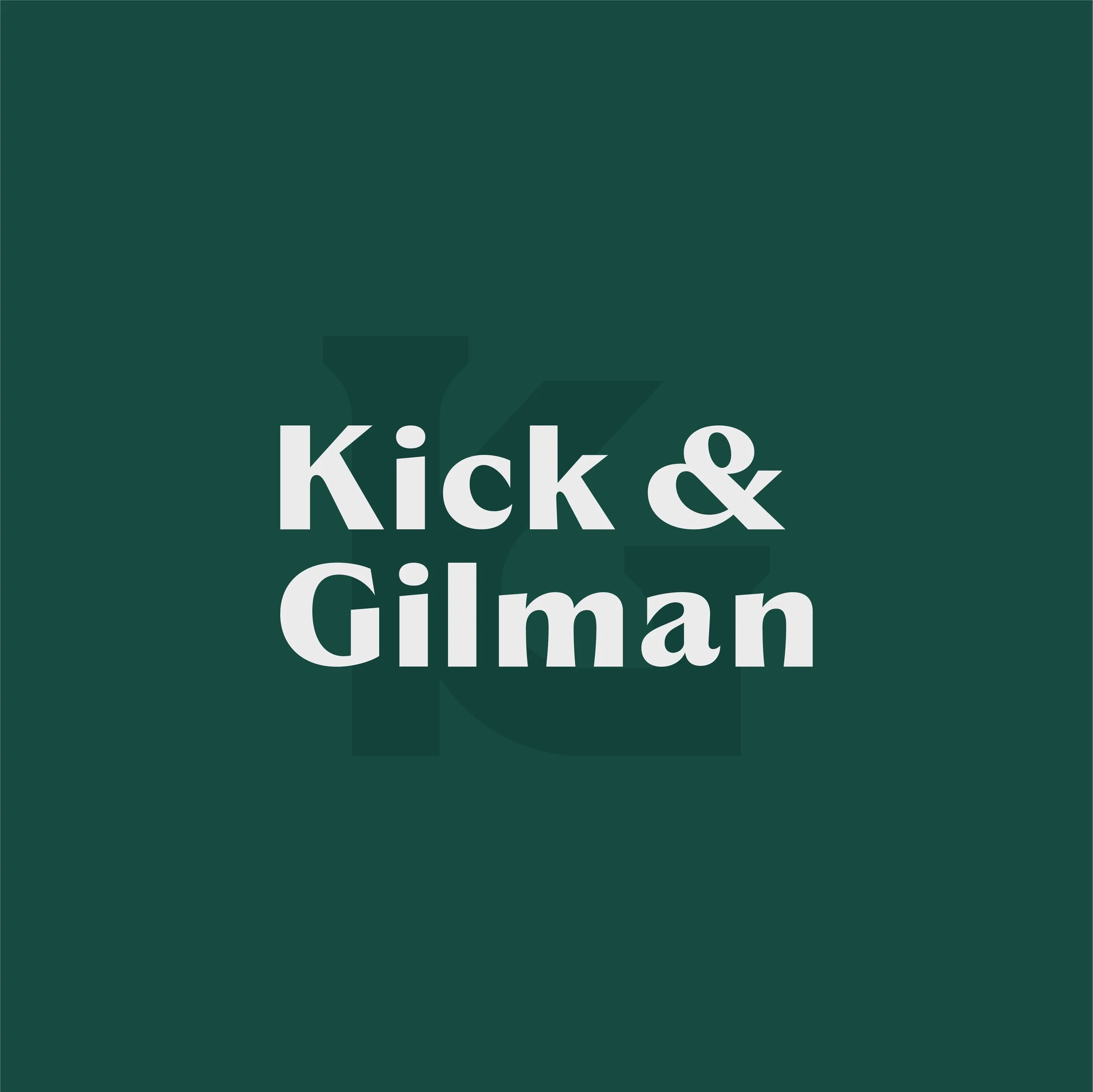
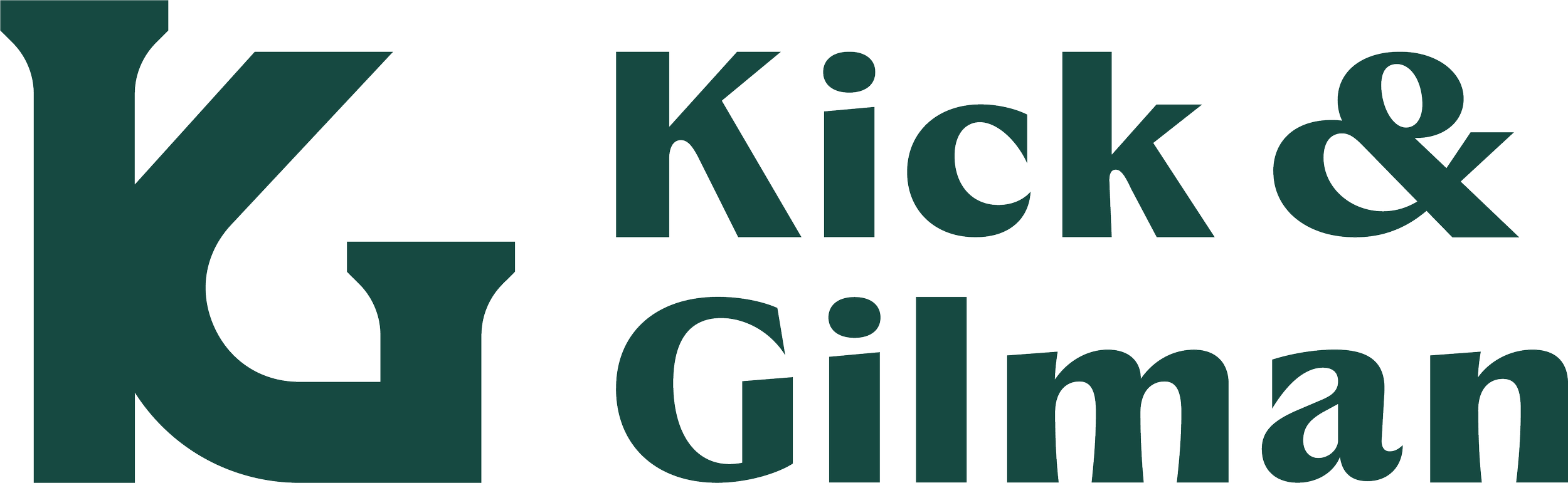
Logo Refinement
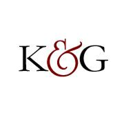
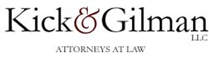
I created a formal logo system that balanced professionalism, clarity, and longevity. The new mark introduced structure and intentional typography, providing the firm with a recognizable visual anchor for the first time.
A refined monogram was also developed to support flexible use across digital applications, social media, and smaller formats.

Before
After
Digital Development
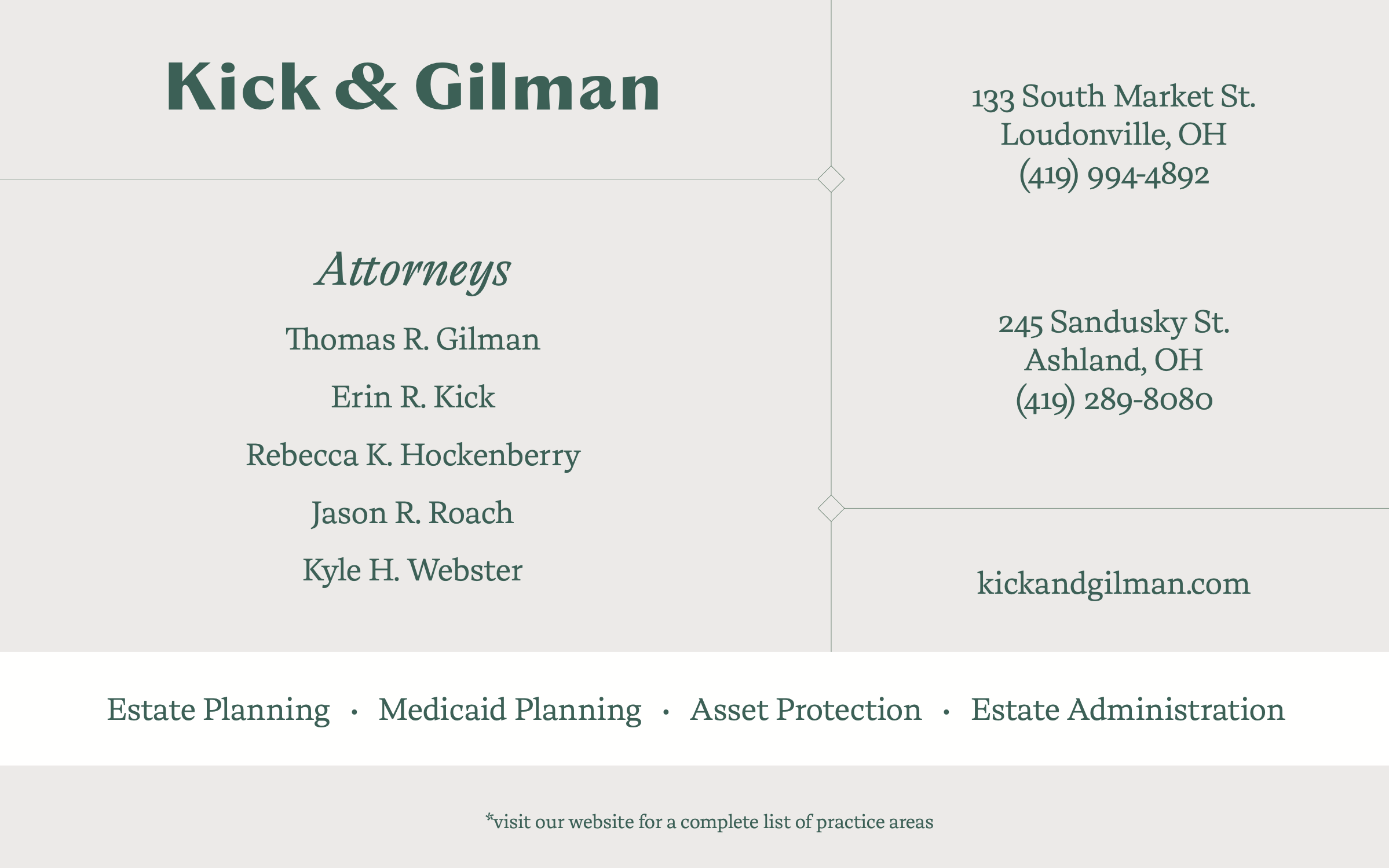
A cohesive visual system was established to ensure consistency across all touchpoints. This included:
A defined color palette centered around a deep green to convey trust, stability, and professionalism
Consistent typography to reinforce clarity and authority
Layout standards for printed and digital materials
Supporting graphic elements for flexible use across formats
This system ensured every future piece could be created efficiently while maintaining a unified appearance.
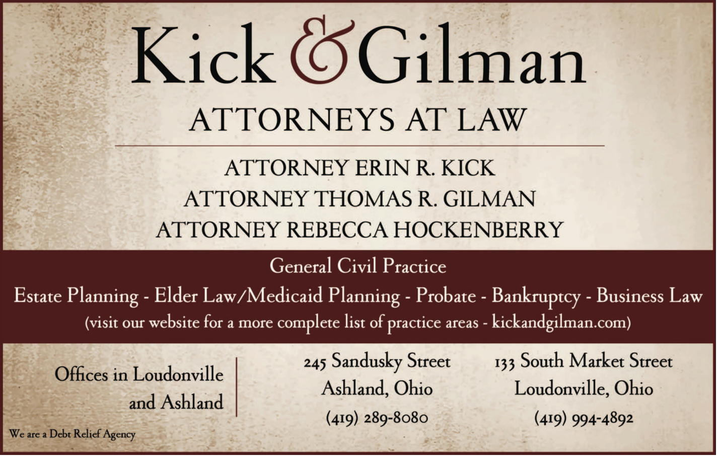
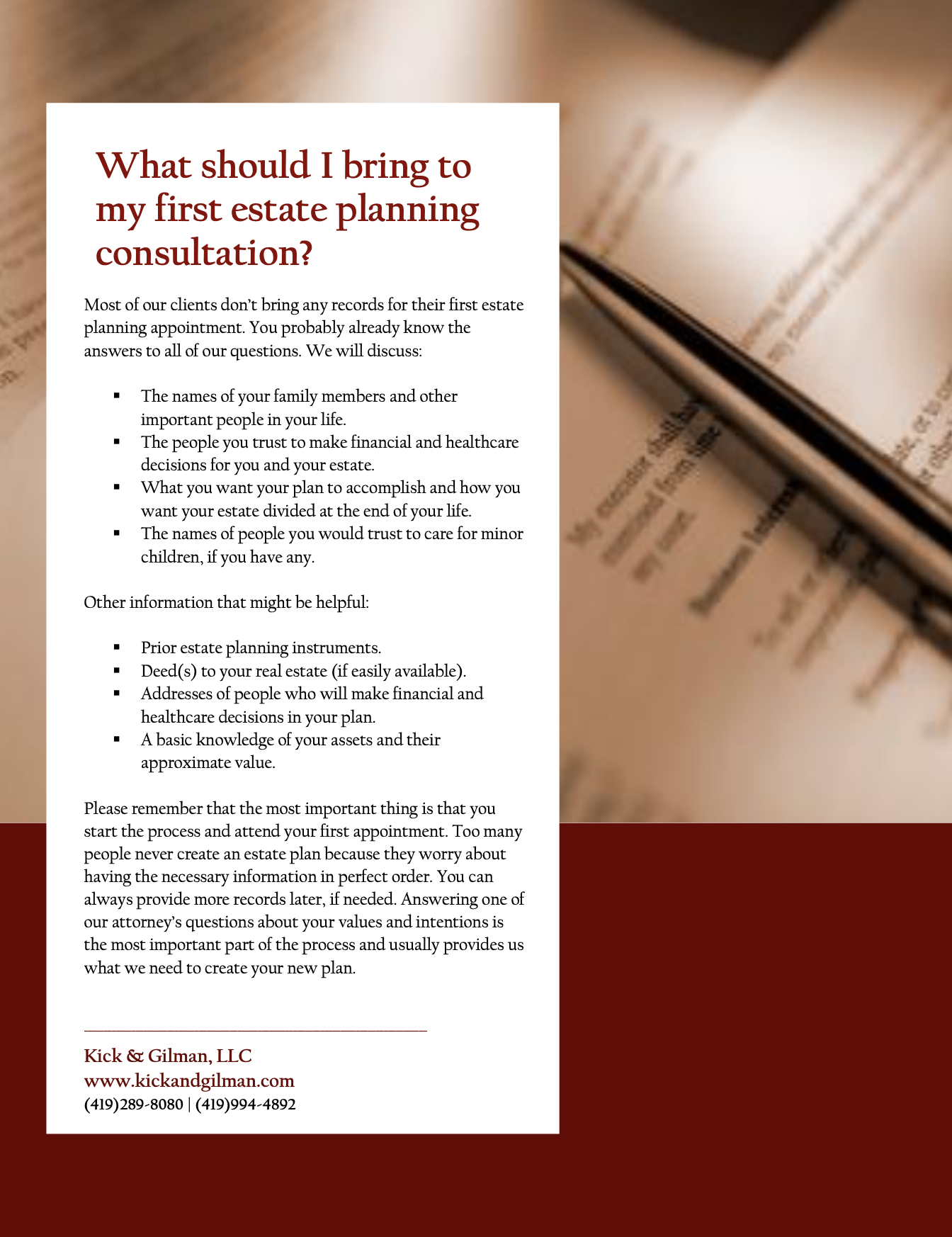
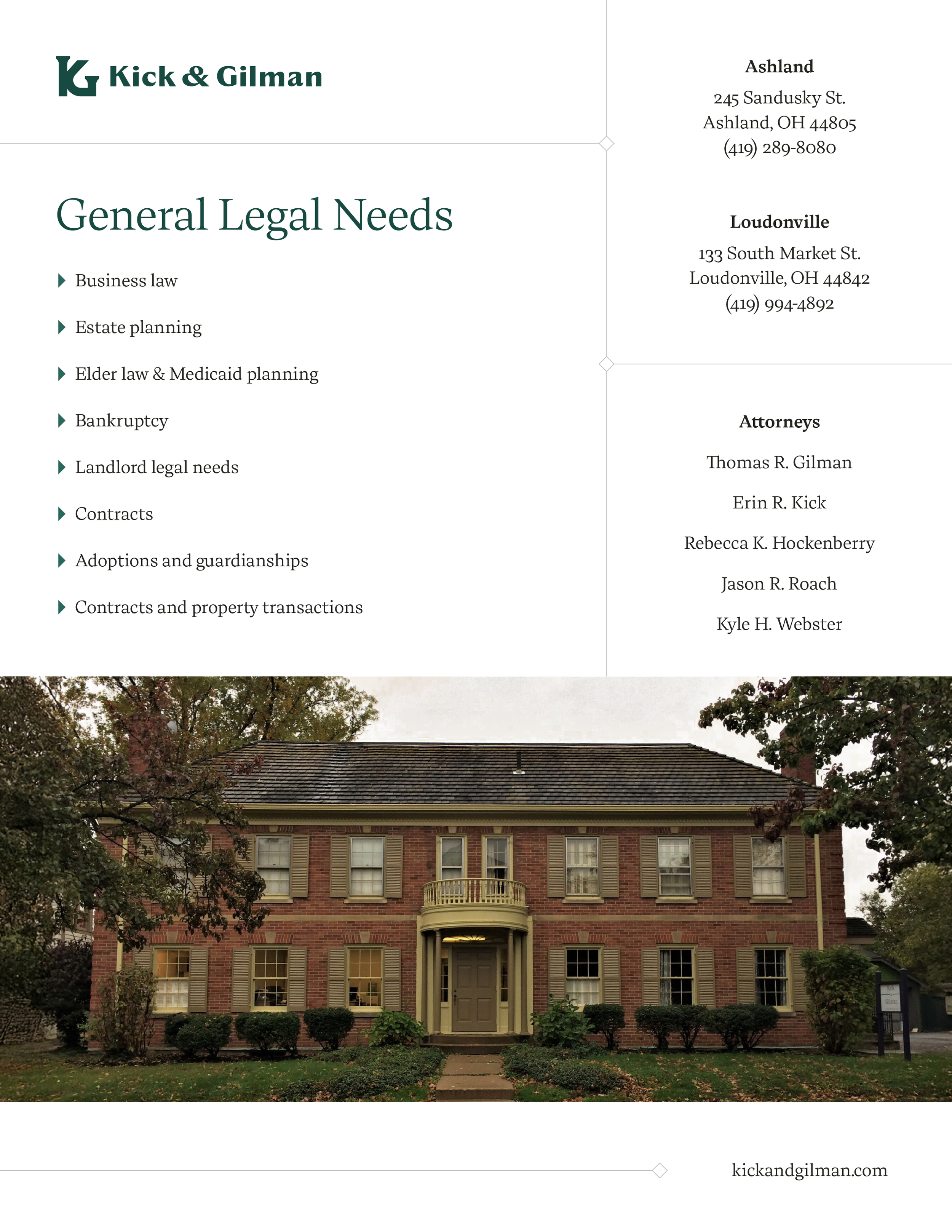
Print Development
With that foundation in place, the PowerPoint template was then built to align seamlessly with the updated brand.
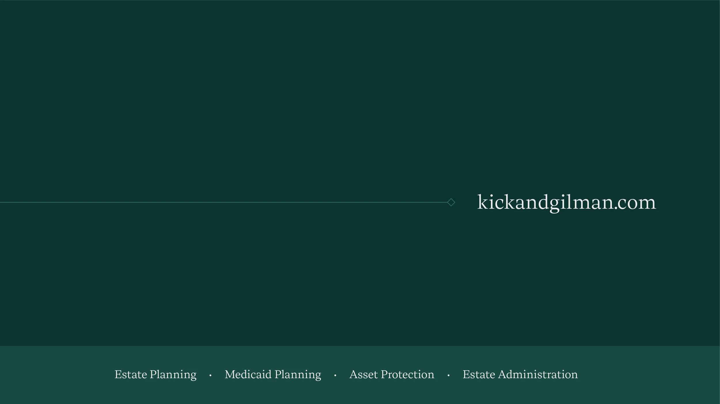
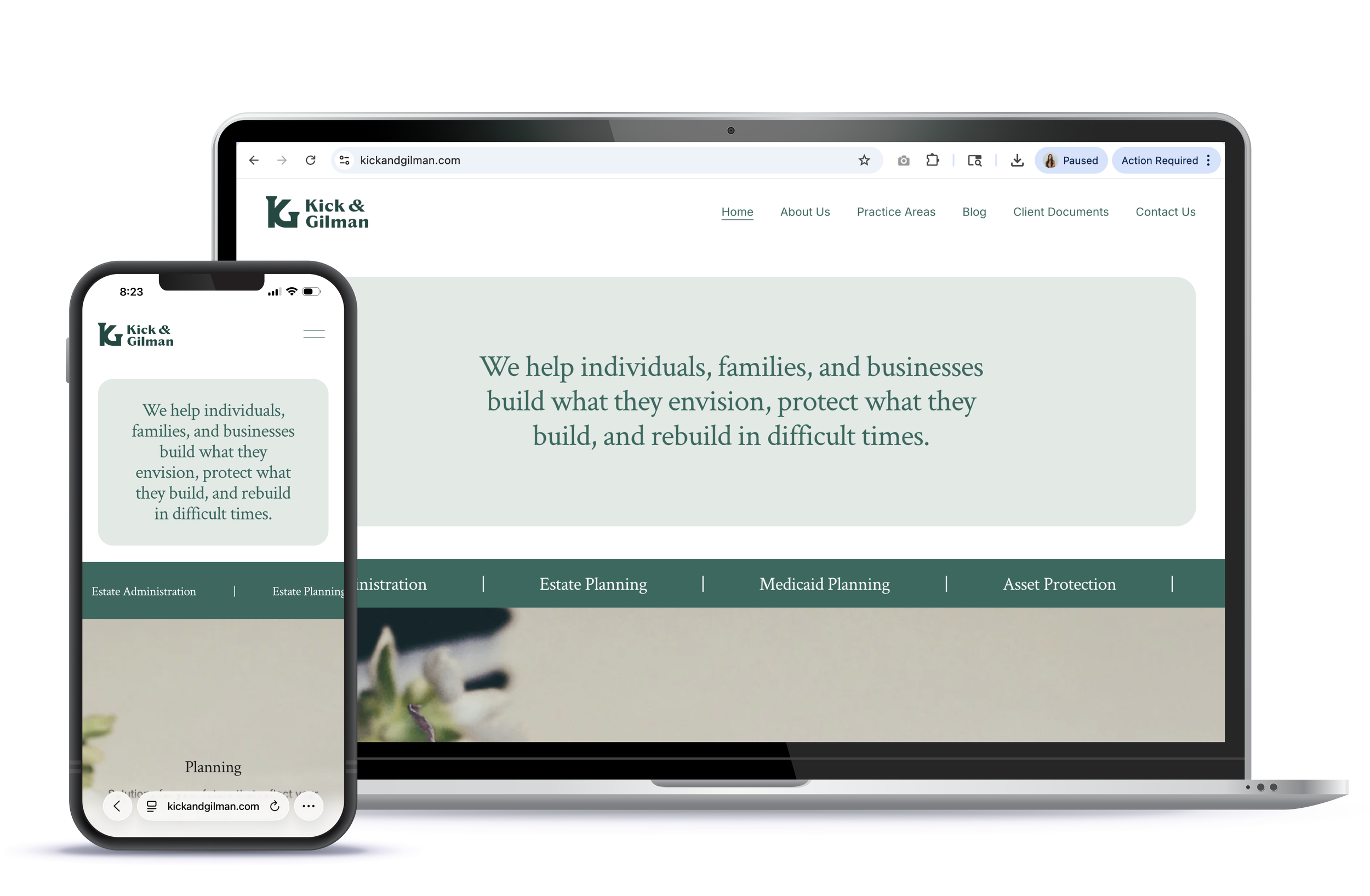
Web Development
The website was redesigned to align with the new brand identity and present the firm in a clear, modern, and approachable way. The updated design improved readability, navigation, and visual cohesion while reinforcing the firm’s credibility.
The website now serves as the primary expression of the brand, creating a consistent experience for current and prospective clients.
View the entire website here: kickandgilman.com
The Impact
The new brand system created:
• Consistency across all touchpoints
• Faster content creation and decision-making
• Increased professionalism and brand authority
• Clear guardrails that protect long-term brand integrity
Strategic Doing now operates with a structured brand foundation that supports growth, reinforces credibility, and ensures every touchpoint feels intentional and aligned.